Case Study

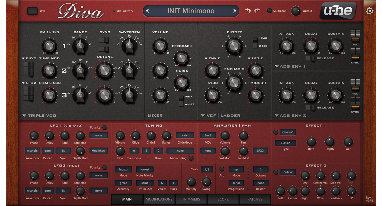
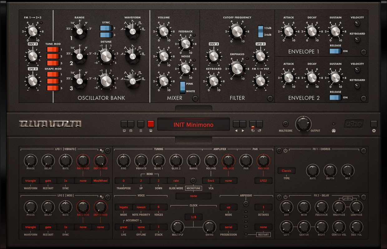
Volta — A GUI for u-he Diva

Volta is a visually and functionally modifieded GUI for the Software Synthesizer Diva by u-he. For further informations head over to the product site at volta.kapetan.net.

This case study gives a small insight into the thoughts, ideas and solutions behind the redesign.

Table of content

(Work in progress)

Overview

Diva is an impressive piece of software. The concept is very unique and straight forward in terms of combining greatness from the past and modern possibilities.
Anyway, the GUI suffers a little bit of visual presentation and there are some aspects in relation to workflow which could be optimized.

Diva Synthesizer

investigation

Diva has got a lot of options to tweak around. They are accessable directly on the main view and along different exchangeable panels. We are going to have a photo-realistic GUI. In the sense of reality it is confusing to have too many panels and layers. Therefore it would be smart to group some of these panels to have less layers to interact with. Also the layout could be fit a little bit more on a grid to keep the layout tidy.

If you dive deeper in the world of vintage synthesizer, or you are well knowledged, you can clearly recognize the connection to its original counterparts. The emulation and combination possibilities of these all time classics are the main feature of Diva. Let's present them.

Strategy

Find solutions to work out the emotional aspects looking into the past and simplify the workflow using modern possibilities. To get the emotional part we are going to present the classics obvious as possible.
There are a lot characteristic details we will use to achieve that. To avoid being visually too complex we will design the modern parts and the casing more decent to focus on the voice part.

But first, let's improve the layout.

A. Layout

Diva Synthesizer
Wireframe — Original u-he Diva

A1. Tidying

There is a loss in clarity through the number of elements. We have to tidy up the user interface to make it more crisp. Aligning to a grid will help in most cases.

Activate further indications through the switch.

Original grid Diva Synthesizer
Before
New grid Diva Synthesizer
After

A2. The Tabs

Tabs are a simple and effective interaction. They fold complex content perfectly and let the user decide on which content to focus.

The idea is actually based on real world folders. They are wrapping a lot of documents and guiding by using labels. In relation to Diva's modules it could be a little bit confusing from a reality standpoint.

Tabs section Diva Synthesizer
Tabs content Diva Synthesizer
Original tab content: Main, Modifications, Trimmers and Scope

In order to clearify the usage to a real world interaction, we will keep the original idea of tabs and translate it into exchangeable panels. By summing up the tab's contents we can spread them into two layers.

Tabs content Diva Synthesizer
New tab content: Main and Tweaks

The result: two layers instead of four. One in the back fixed on the case for tweaking and one in the front visualized by a panel that holds the more often used modules. The front panel can be ejected or slided downwards.

To keep it simple: the fifth tab "Patches" will have its own place on the meta section near to the "Save" button.

Diva Synthesizer
Tab open

A3. Synergy of two worlds

Thinking about Diva as a charakter reveals that the voice section could be the soul and the modulation and tweaking section the body. To highlight that idea we put the "soul" in the upper half and the "body" in the lower half.

Meta section before Diva Synthesizer
Before
Meta section after Diva Synthesizer
After

Centering the meta layer engages the possibility to push the upper panel upwards too. Now there is extra space left which can be used for additional features. This brings us to the next idea to solve a problem.

A4. Advanced LFO Panel

Earlier we simplified the tabs section by summing up all four panels into two layers. That uncovers a problem regarding the interaction between adjustments on the "tweaks" section and modulating them with the LFOs without switching the lower front panel up and down.

Through rearranging the layout, there is useable place left behind the upper panel. To have a fluent workflow we need the possibility of interacting with the LFOs in every situation. A more advanced LFO is the answer here. It will have its place under the upper panel and the interaction with all sections is given. Secondly, it is quiet useful to have direct visual feedback and to get a more detailed view of the LFOs.

Diva Synthesizer
After
Meta section before Diva Synthesizer
Both panels open: access to LFO from Tweaks
Meta section after Diva Synthesizer
Upper panel open: access to LFO from Main

B. Graphics

Work in progress!

B1. Counterparts

As mentioned in the beginning we considered that we want to push the emotionional side of Diva. To achieve that we are going to design the voice circuit obvious as possible in relation to their counterparts. To move the vintage part into the spotlight we will set it into a decent casing. There have to be some neutralism to fit with the different looks of the "oldtimers".

B2. Material and shape

To get a haptic feeling we introduce black sanded metal, knobs and buttons get rubbery surface with a kind of grip. We get rid of the red coloured panels. They generated a contrast to the voice part, but it can be too distractive when you work in a long session. To keep a relation to the Diva red, some elements could be styled in a red tone. The contrast between red and dark colors is now more extreme what makes it more thrilling.

B3. Interaction

B4. Signal Flow

A really interesting thing is, how the voice circuit changes the signal flow when combining different voice parts. Again, It would be very interesting to have a visual feedback here to understand in which way the signal flow changes.

Final

Diva Synthesizer
Before